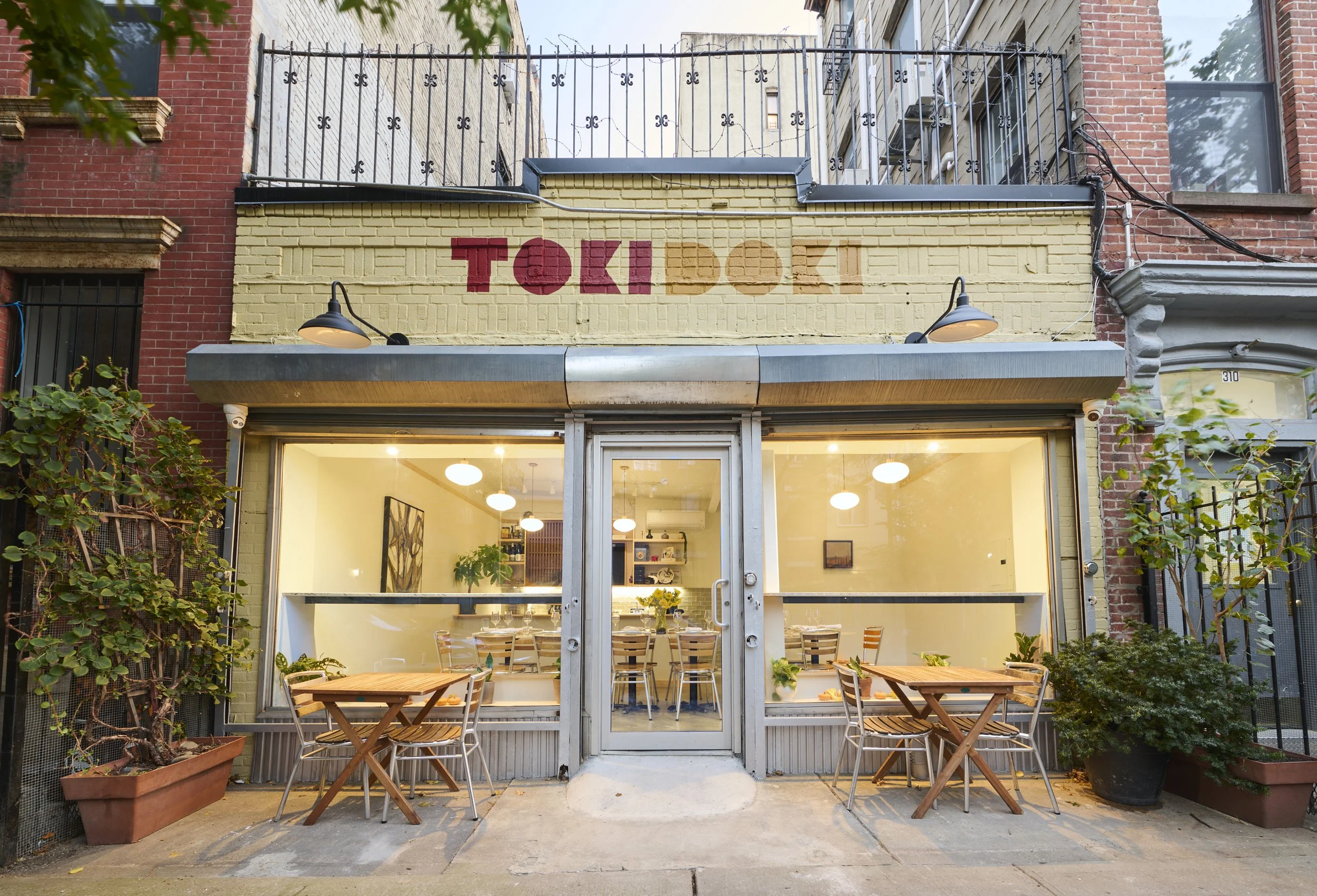
TOKI DOKI
Growing the family
Aaron and Sawa approached Campfire to create Toki Doki, a new café concept designed to complement their acclaimed restaurant, Shalom Japan, which is a celebration of the married chefs Jewish and Japanese roots and culinary passions.
The challenge was to create something that felt unmistakably connected to Shalom Japan while giving Toki Doki its own personality that is more casual, playful, and joyful.
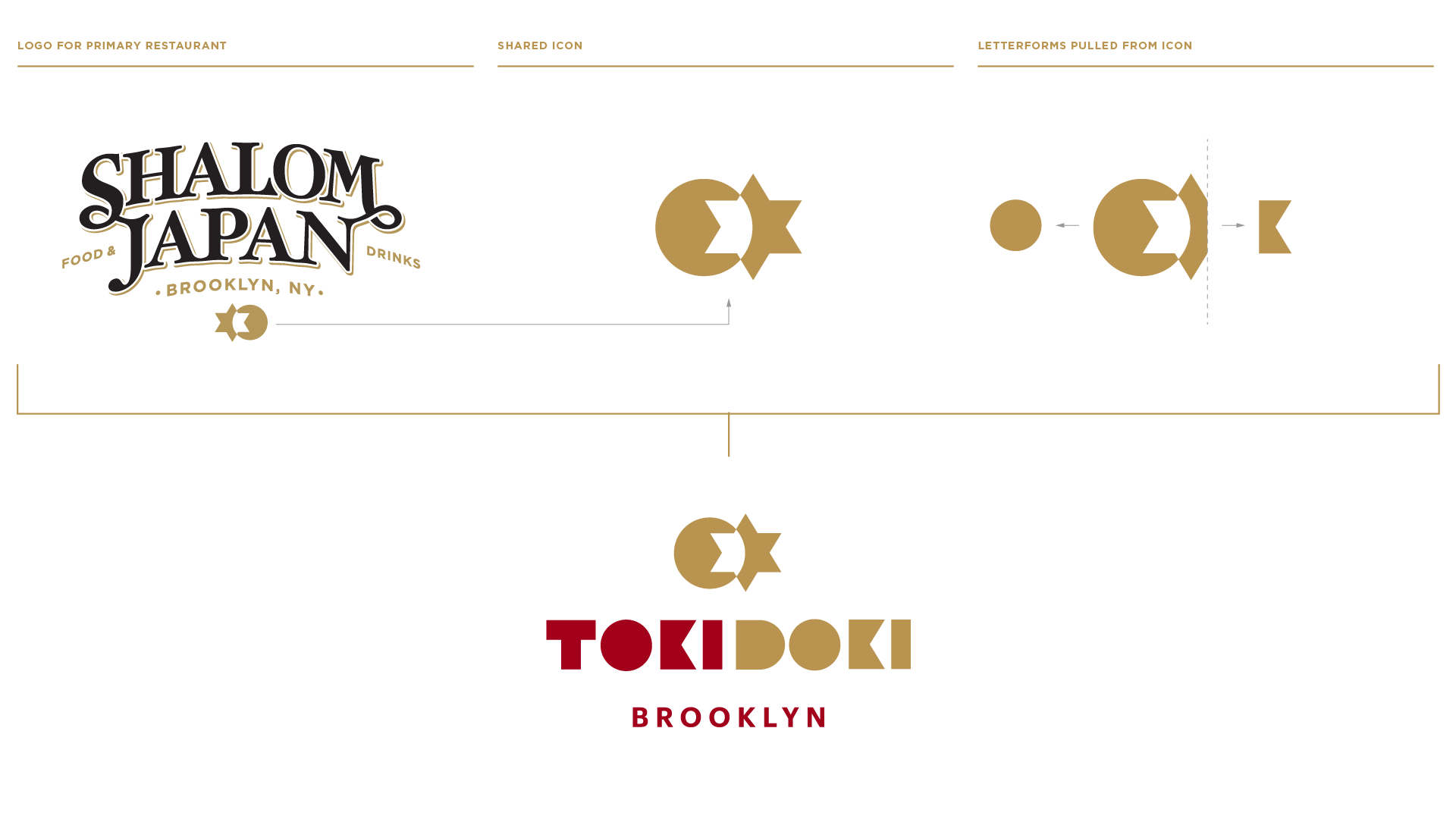
At the heart of both brands is the icon we originally created for Shalom Japan back in 2013 that captures the fusion of Japanese and Jewish culture and cuisine. The mark has become a meaningful part of the restaurant’s identity. For Toki Doki, we brought that same icon forward as a visual thread connecting the two concepts.
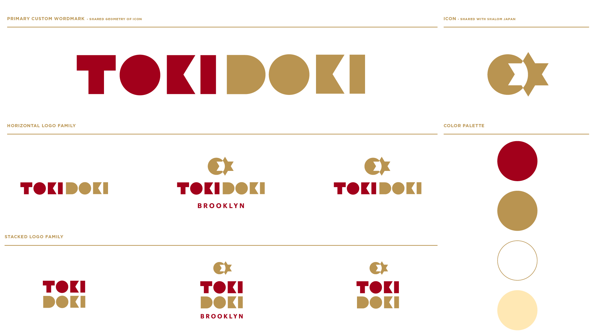
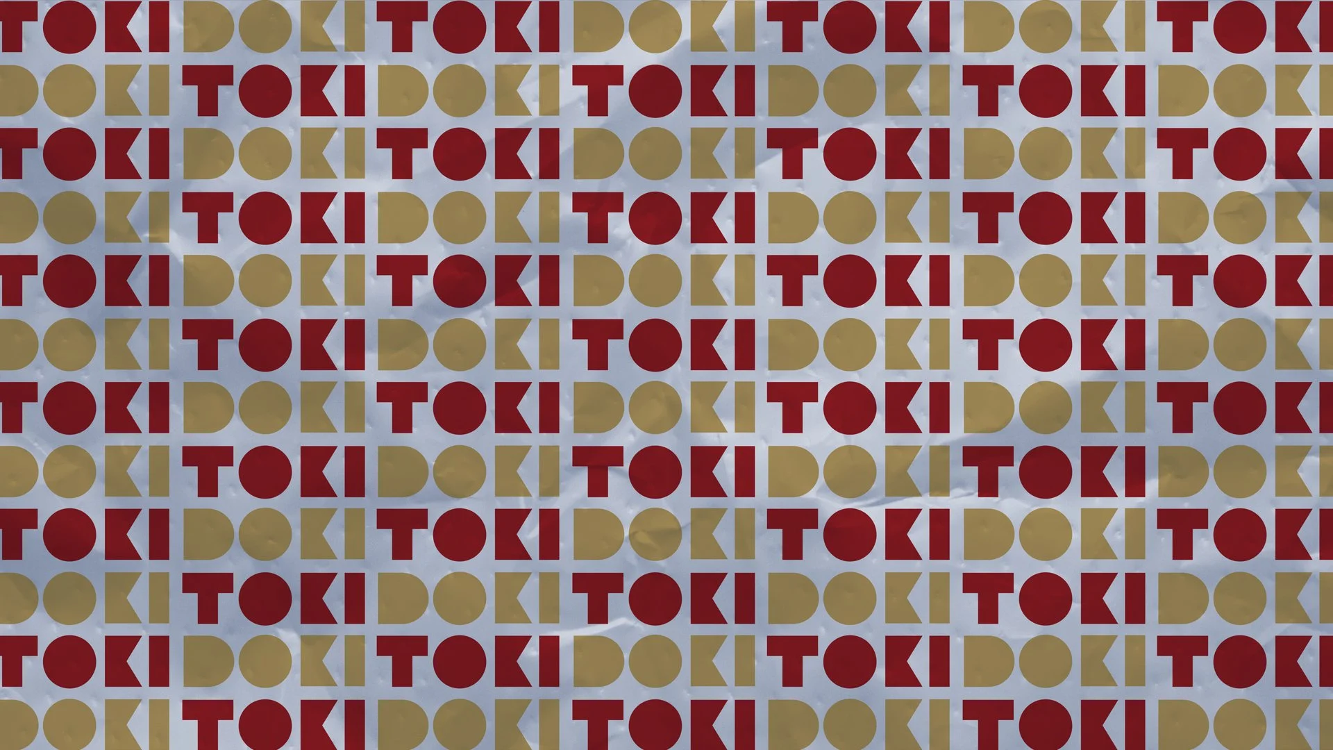
We paired it with a custom word mark that is built from the geometry of the icon so it pairs beautifully with the icon while giving it a fresh and joyful expression capturing the more casual atmosphere of the café. The identity was then expanded into a flexible logo system and custom brand pattern, creating a cohesive visual language that could stand on its own while still feeling like part of the Shalom Japan family.
Logo development
Custom Typography
Brand Pattern