Wine PACKAGING
From the land to the label
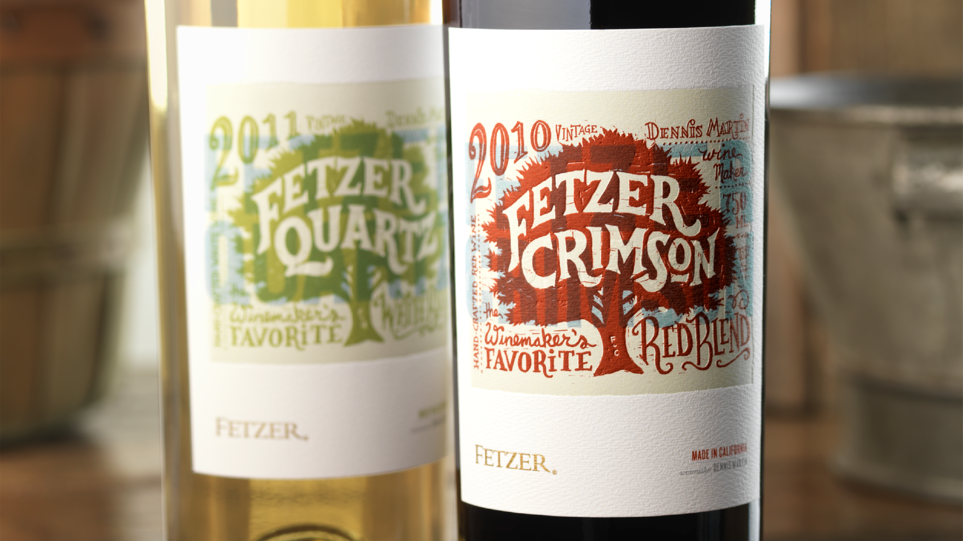
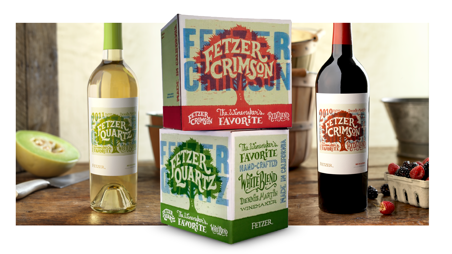
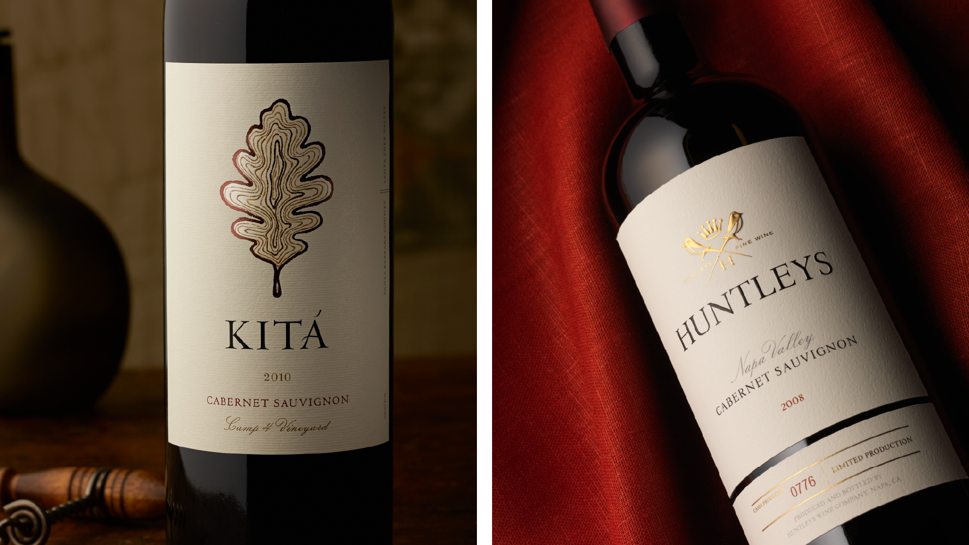
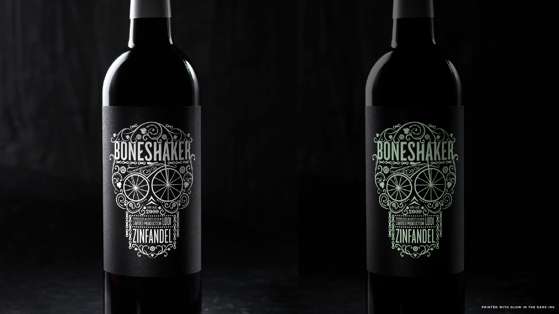
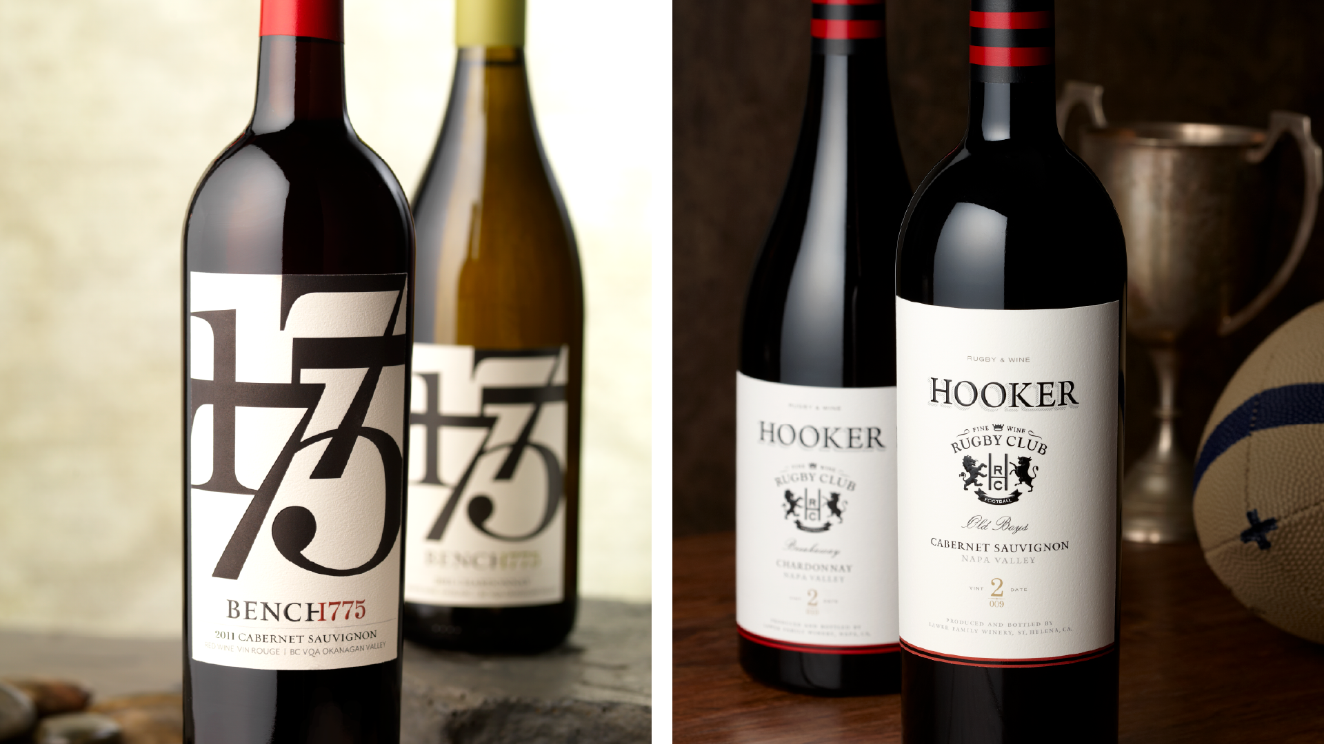
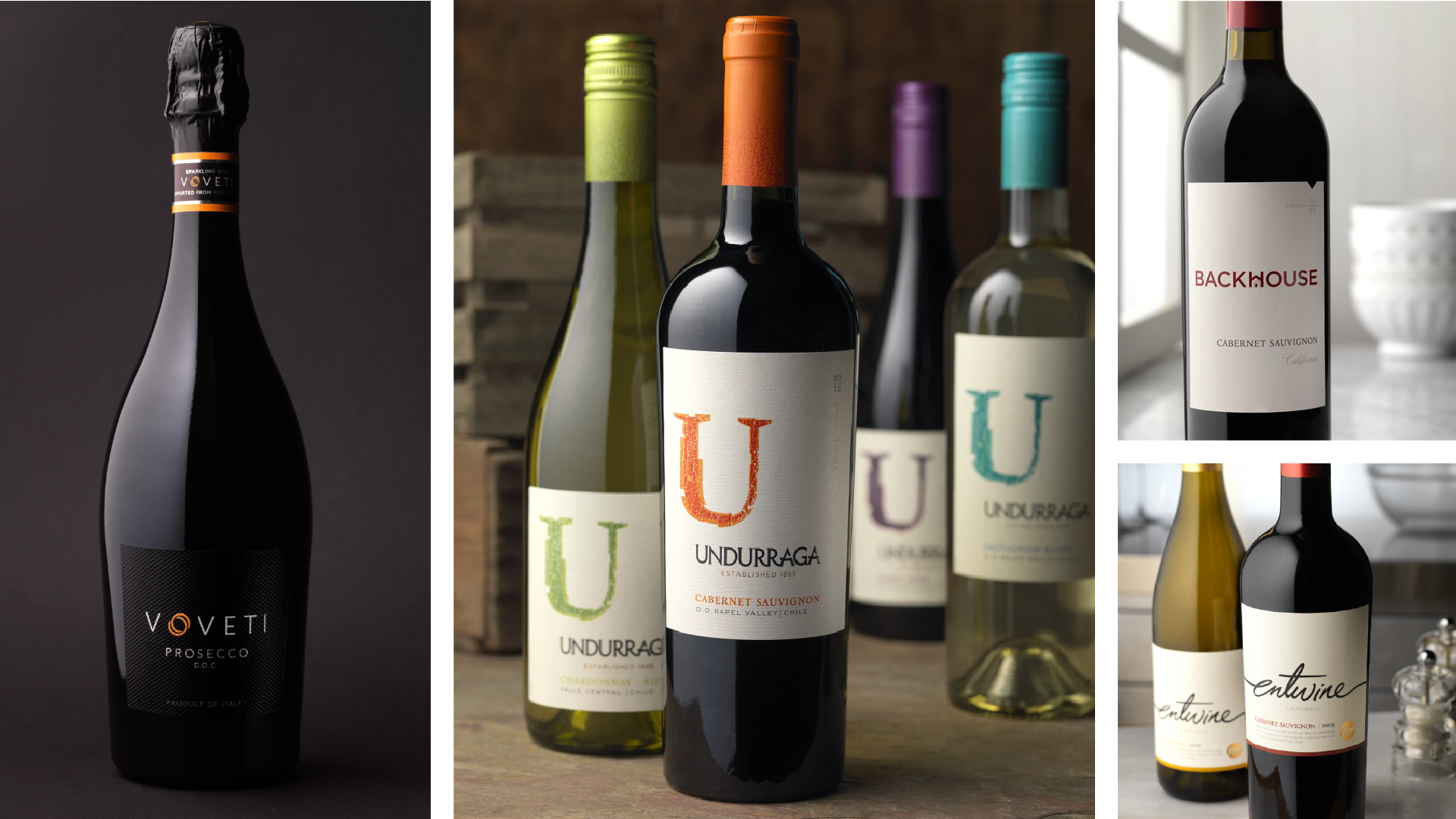
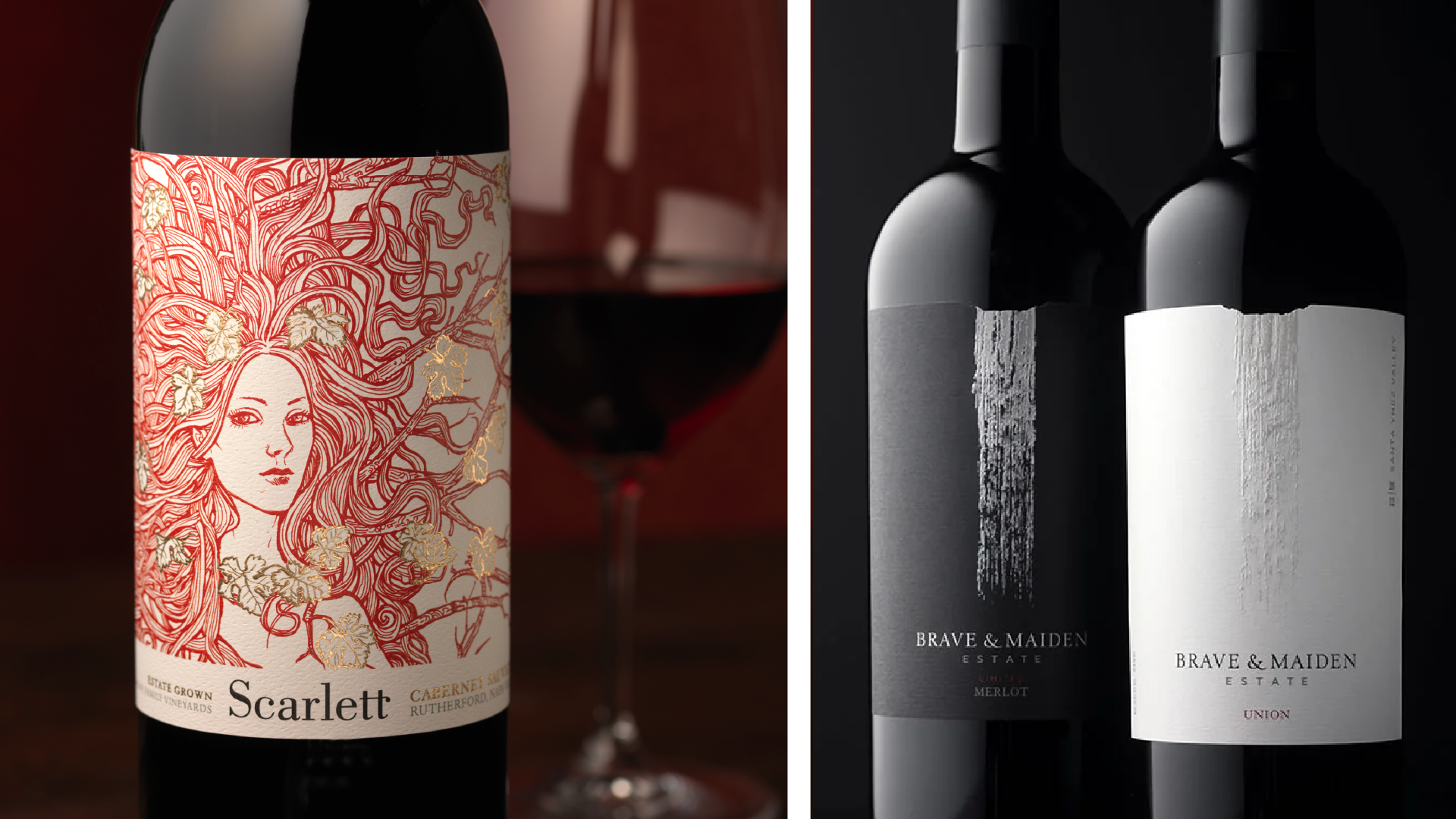
I spent several years living in Napa, working at CF Napa Brand Design, where I had the opportunity to work deeply in the wine & spirits industry. It was a pretty special chapter of my career—and one that shaped how I think about branding, packaging, and storytelling.
There’s something uniquely rewarding about designing for wine. A great label has to do more than look beautiful on a shelf. It has to tell a story, create intrigue, communicate what’s inside the bottle, and ultimately become part of the experience and ceremony of opening it.
Because wine is about so much more than the wine itself. It’s conversations around a table, food shared with friends, long evenings, celebrations, and stories that get better with time.
And then there’s the contradiction I love most: wine can be an incredibly premium and elevated experience, yet it always comes back to something wonderfully humble—the land, the climate, the farmer, and the craft of turning what comes from the earth into something worth gathering around.
That balance between refinement and authenticity is what makes wine such a fascinating category to design for. It’s also a category I genuinely love.
When I started Campfire, I named it in part for those moments around a fire with a glass of wine—or bourbon—and good friends, when the conversation gets going and stories get told. Building brands that create a little more of those moments feels like something worth building.
Work shown is from my time working at CF Napa Brand Design.
Packaging
Custom Typography
Branding
Illustration